


heavenlike is a women's clothing start up brand that I was hired to make shirt designs for. When I first got the offer to work with this client, I was very hesitant to accept because I have never worked with anything women's clothing related. To add to that, the client wanted the designs to have a very illustrated look and style. For me, this was a much bigger challenge than designing for a women's clothing brand because I have little to no experience in illustration. For basically all of my time in design all of my work has been entirely digitally made. Nonetheless, I decided to take a chance and accept the work opportunity.
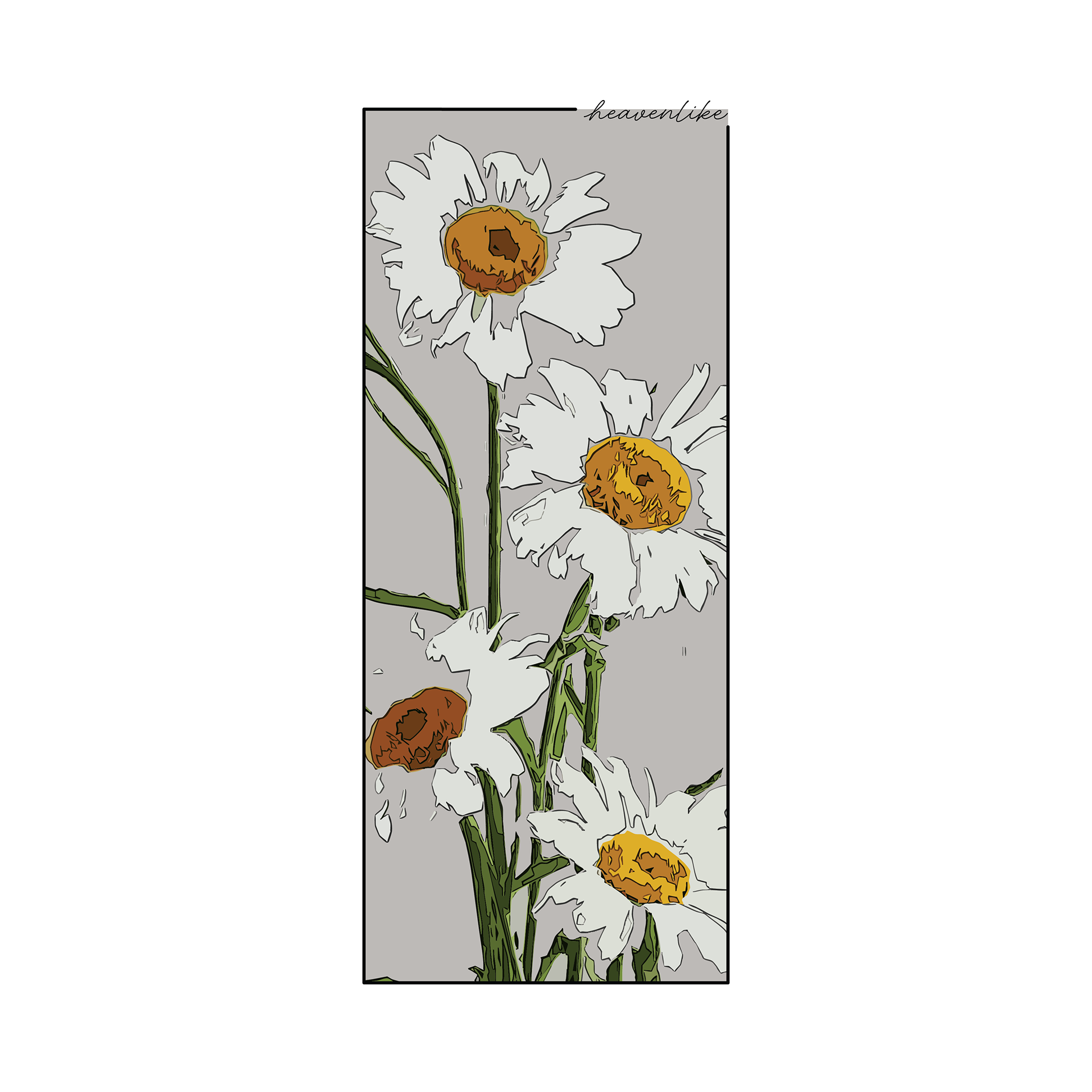
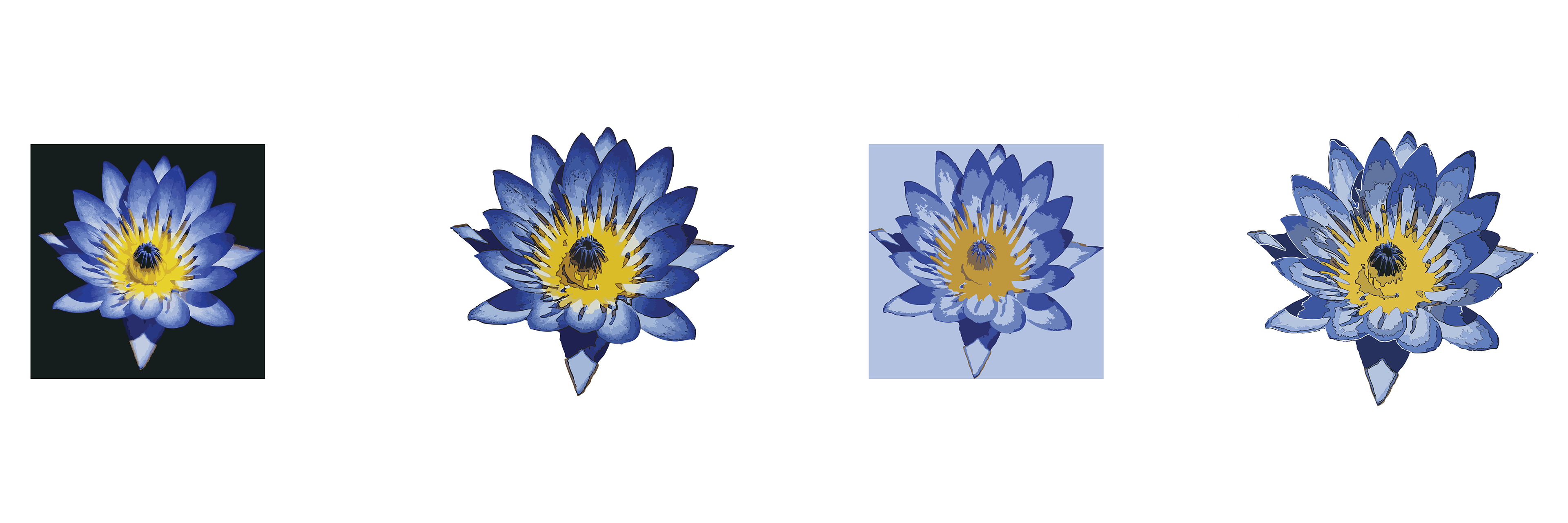

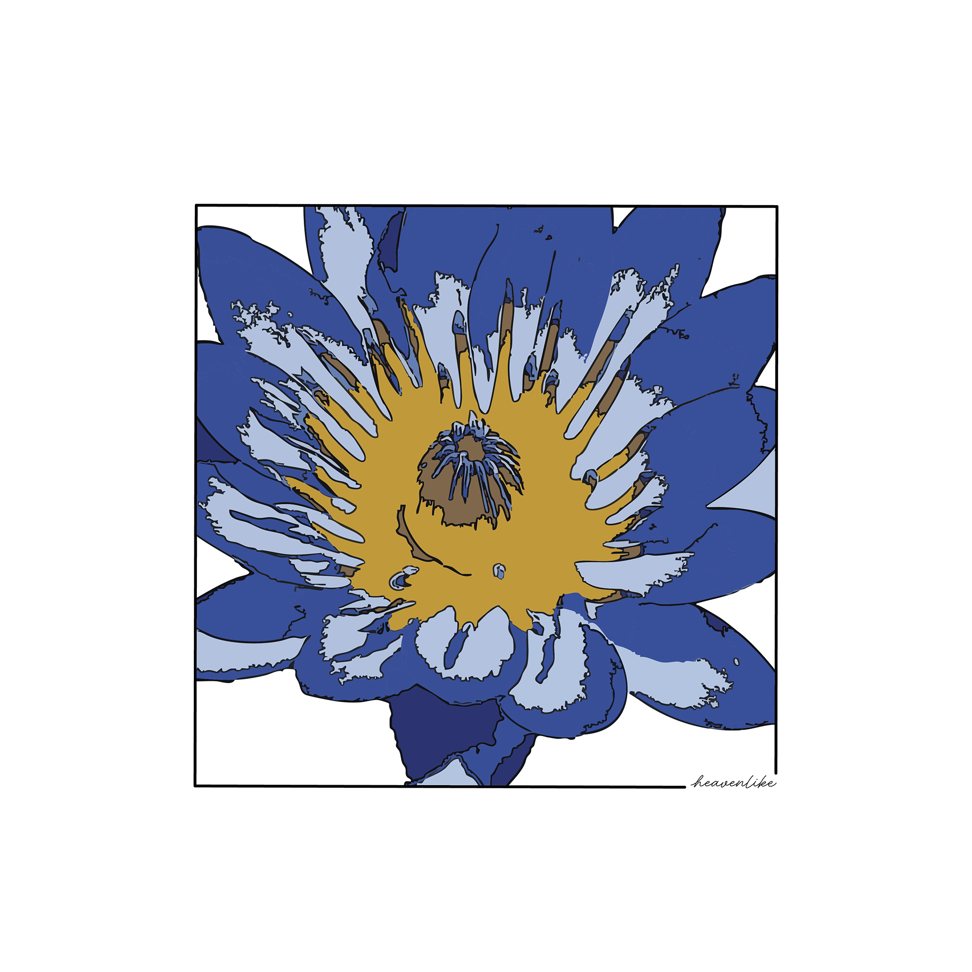
For these two floral designs, the client had asked me to go for a water color effect. Shortly after using the "Image Trace" tool in Illustrator to give the original images a watercolor or hand painted look, I found out about the "Cutout" filter in photoshop. That was when I decided to pivot from a watercolor/painted style to a more flat and almost comic book like style. I knew that this wasn't exactly the style that my client was going for, but I took the chance (because I really liked it) and they ended up loving the final result. The part I found more interesting about these designs, and most different/new to me, was manually going into each design and editing the segments and colors. I did this to make sure that there weren't too many colors in the final design so that it would maintain that flat, comic book like style that I found myself being really in to.
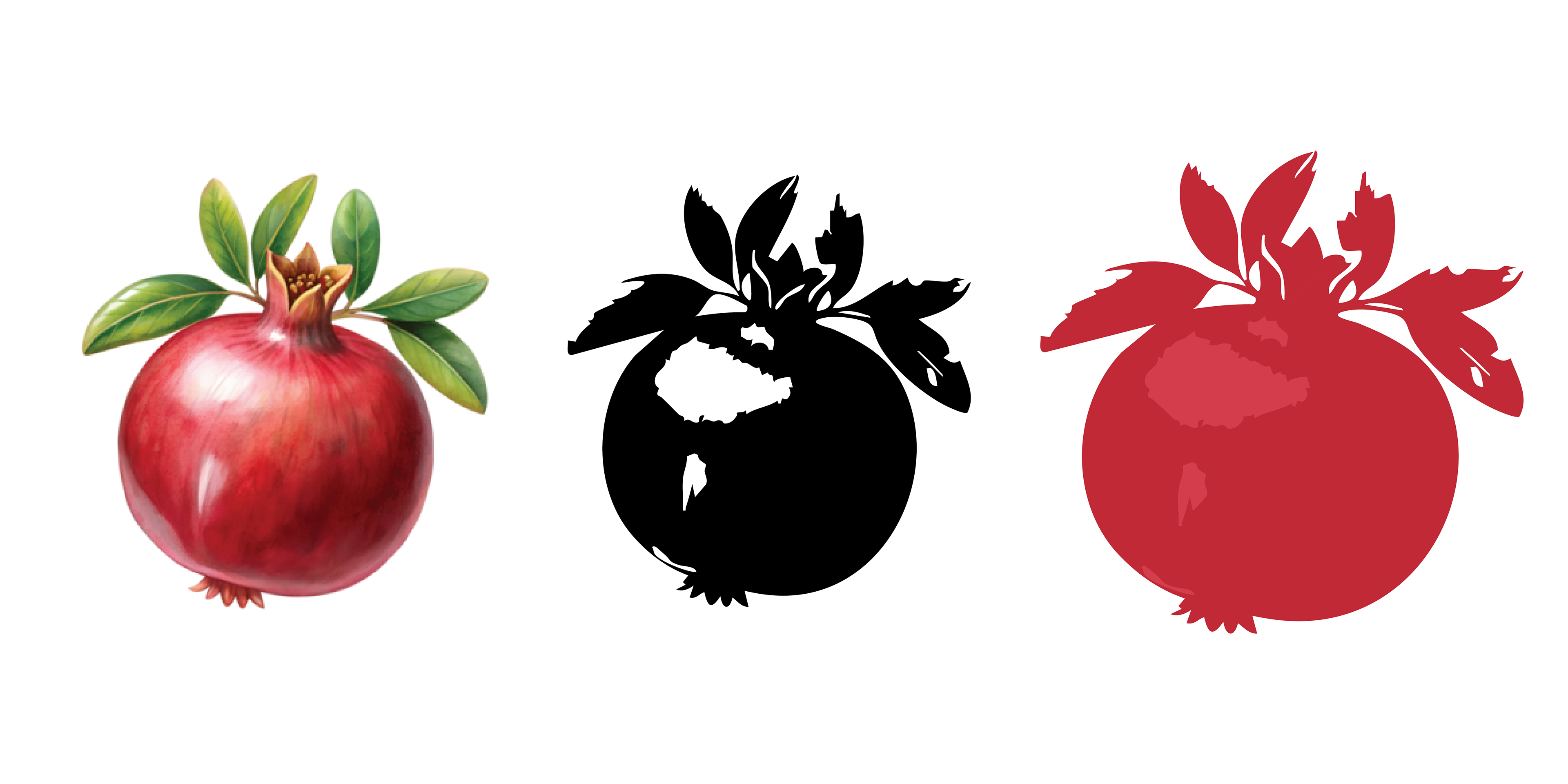
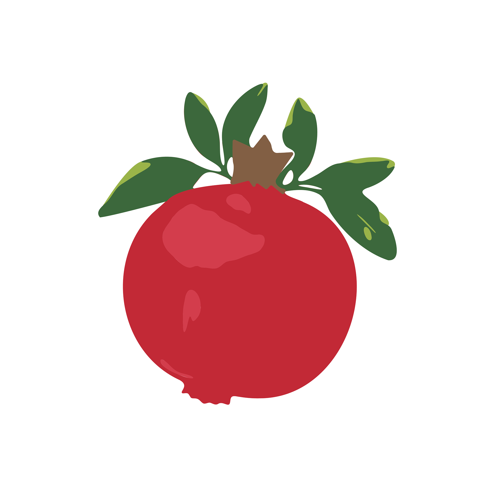
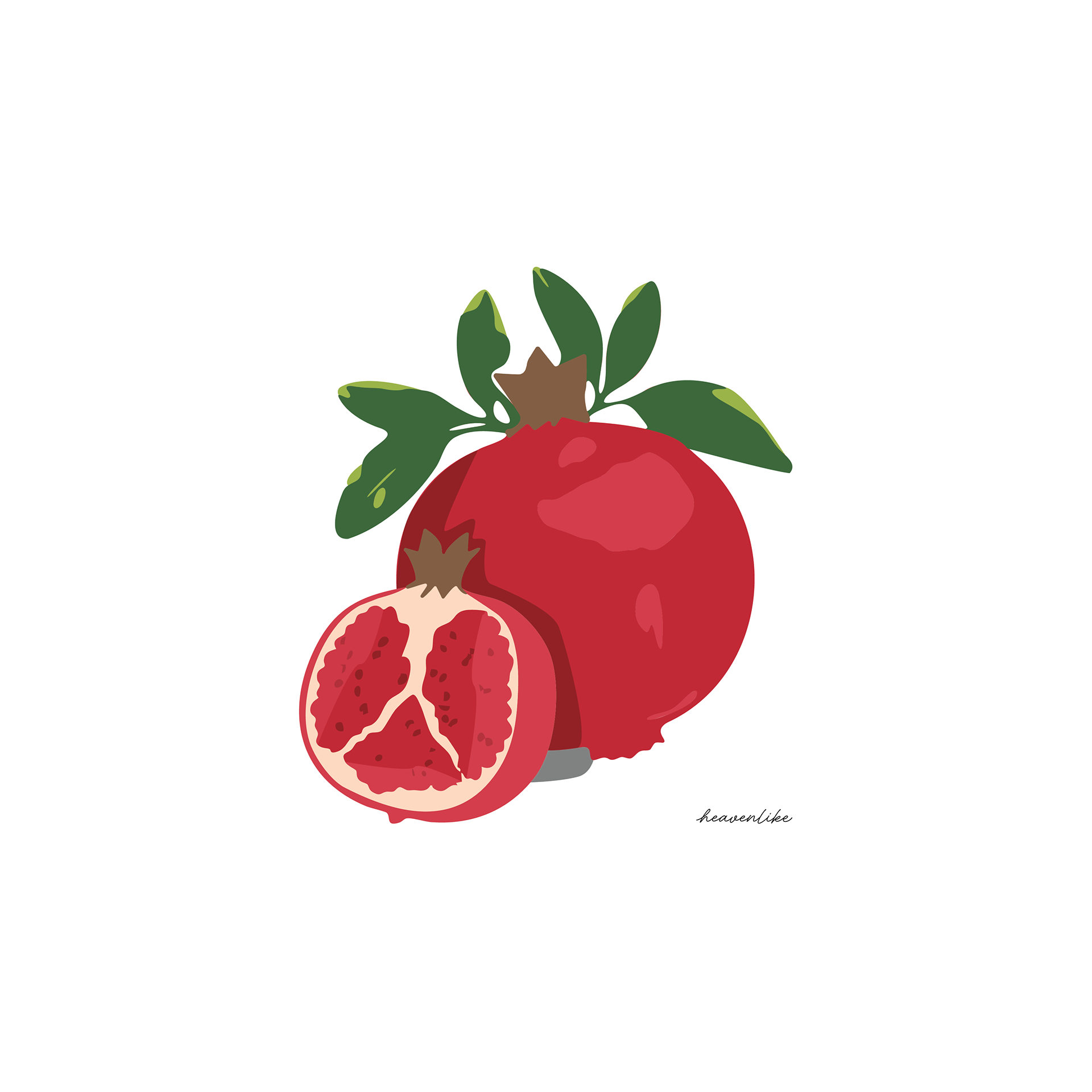
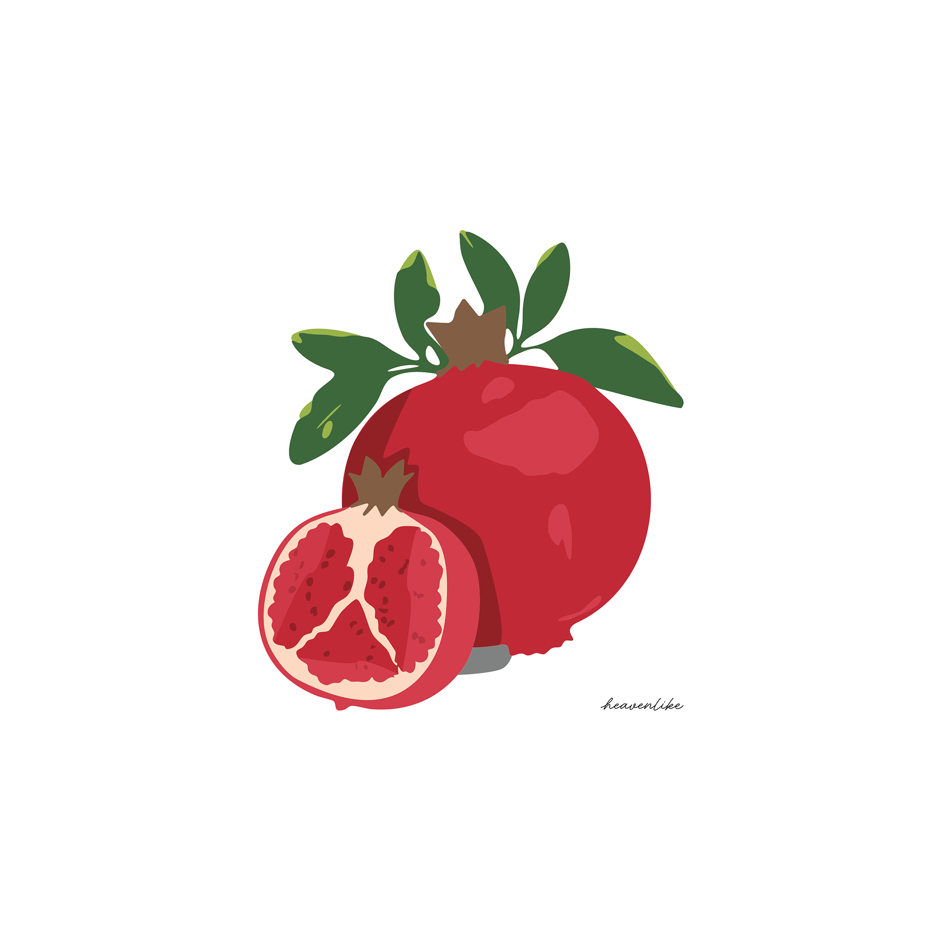
For this pomegranate design I wanted to simplify the style and colors even more. My process for these designs usually started out by me finding an image and using the "image trace" tool in Illustrator to give it that sort of hand drawn or painted look. This design was a bit more challenging than the last because I had to simplify the whole design into 3-6 colors. I used the "image trace" tool to get silhouettes of the original images and then I recolored the individual parts of the silhouettes to match the original image. One final touch that I found really helped me get to the look and style that I wanted to was simplifying all the paths of the final composition in order to get rid of jagged or sharp edges.
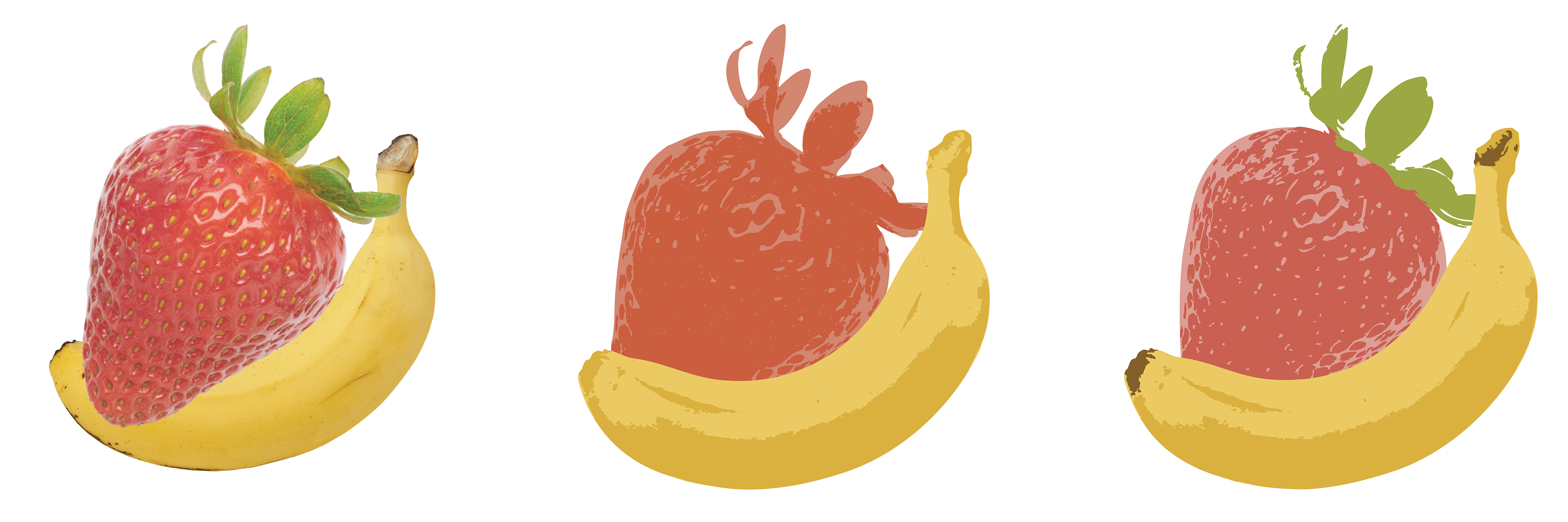
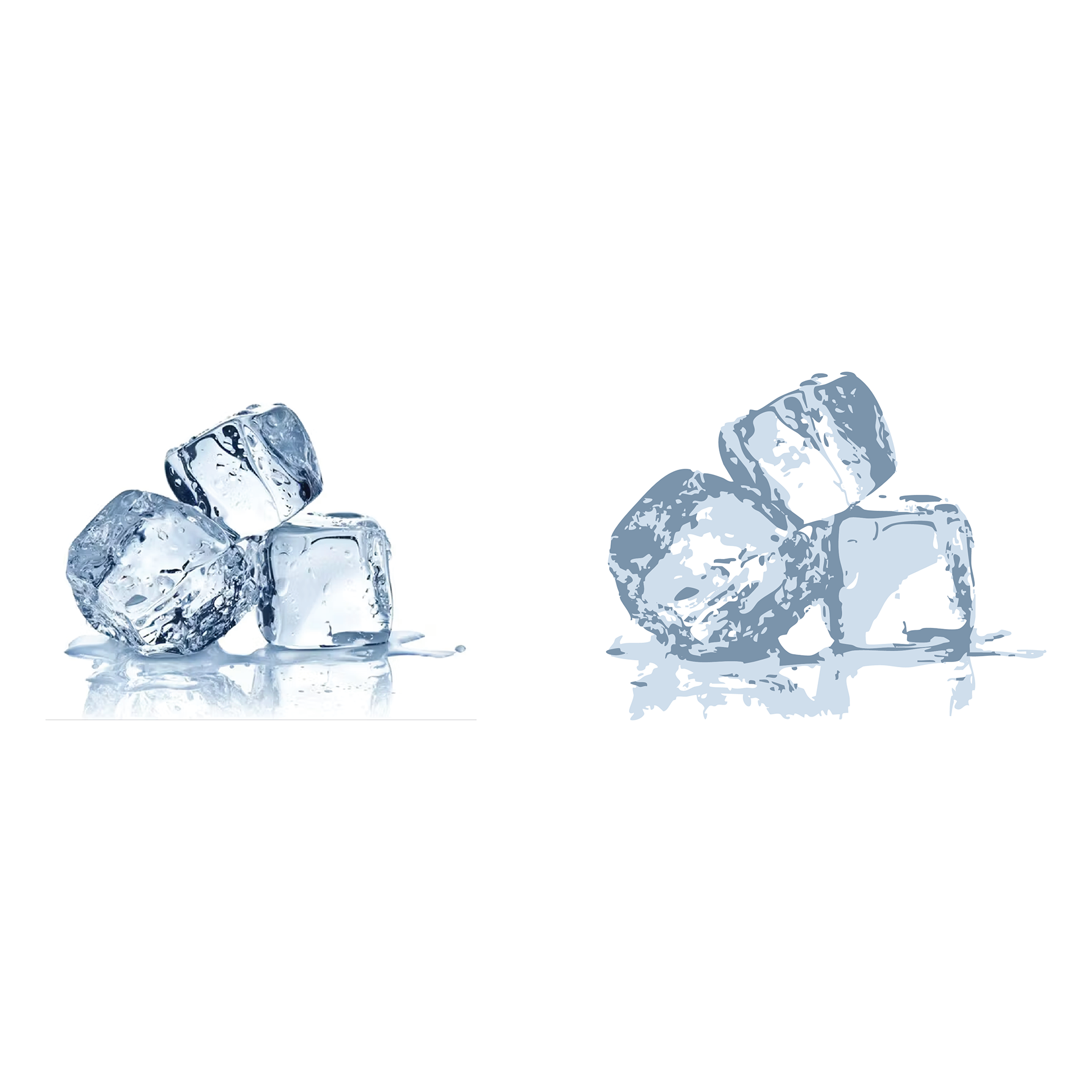
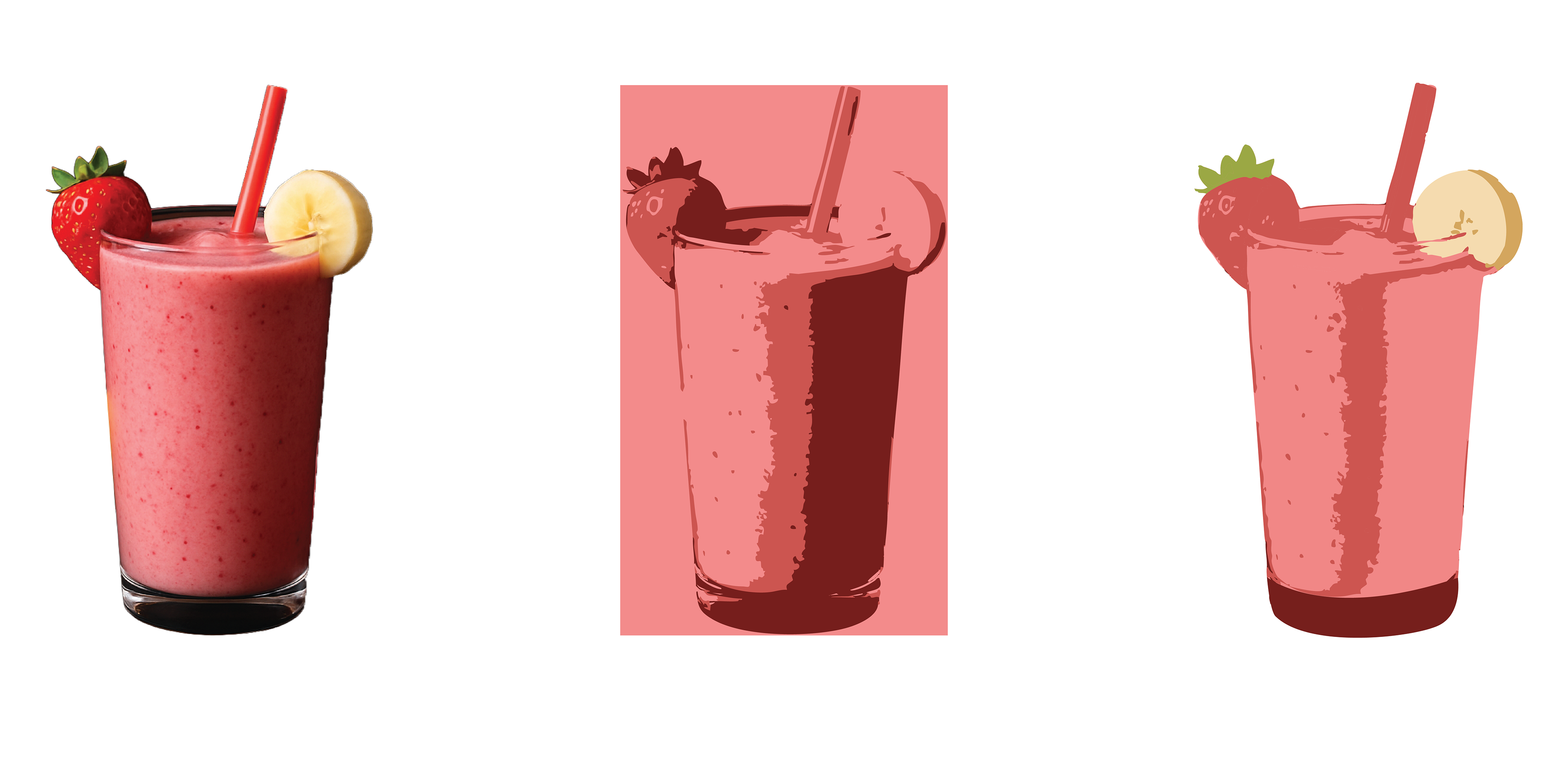
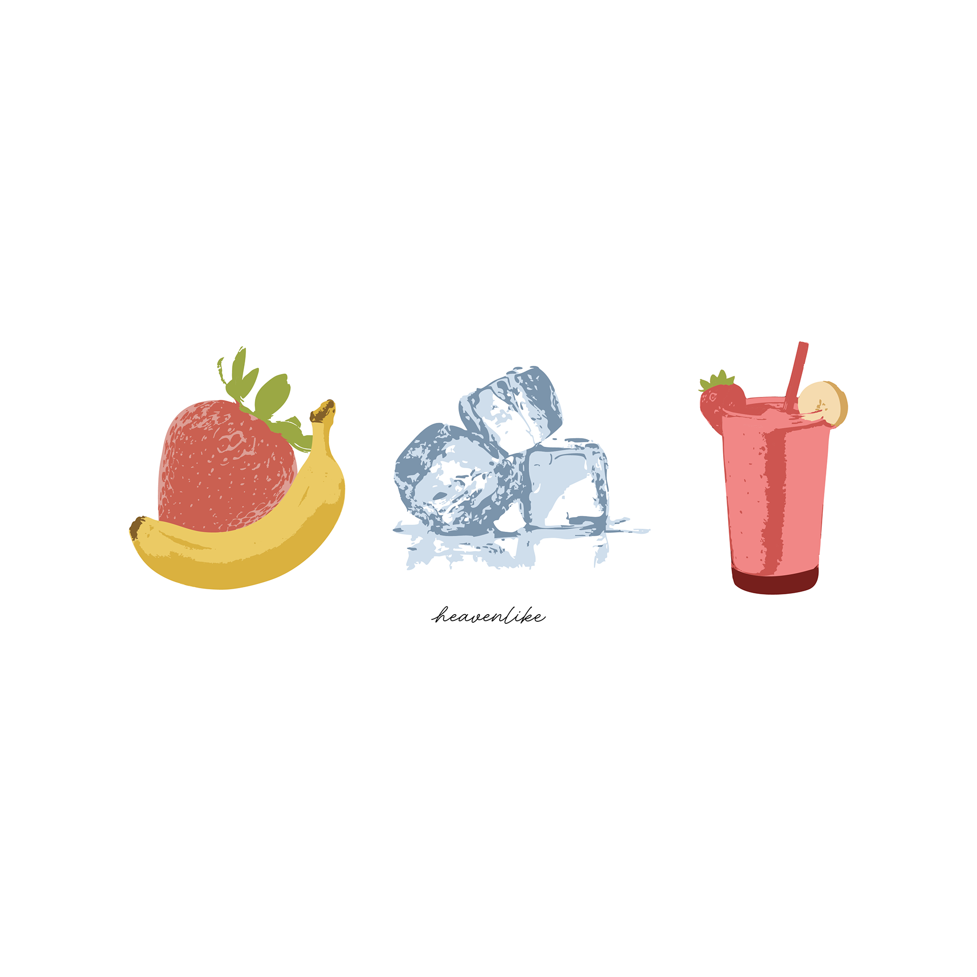
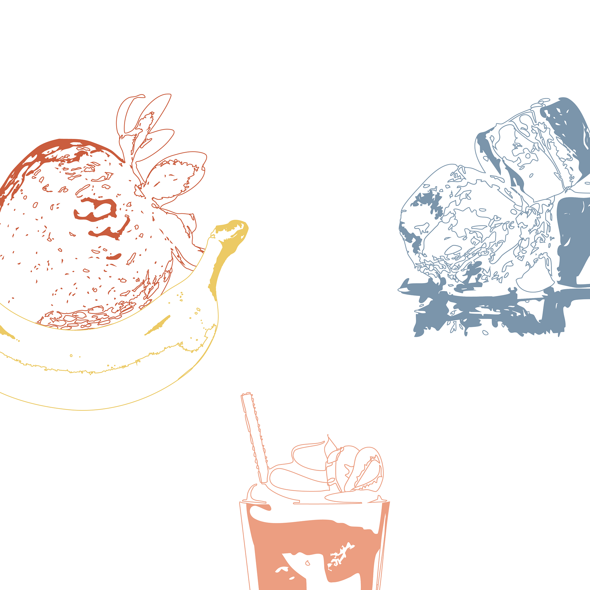
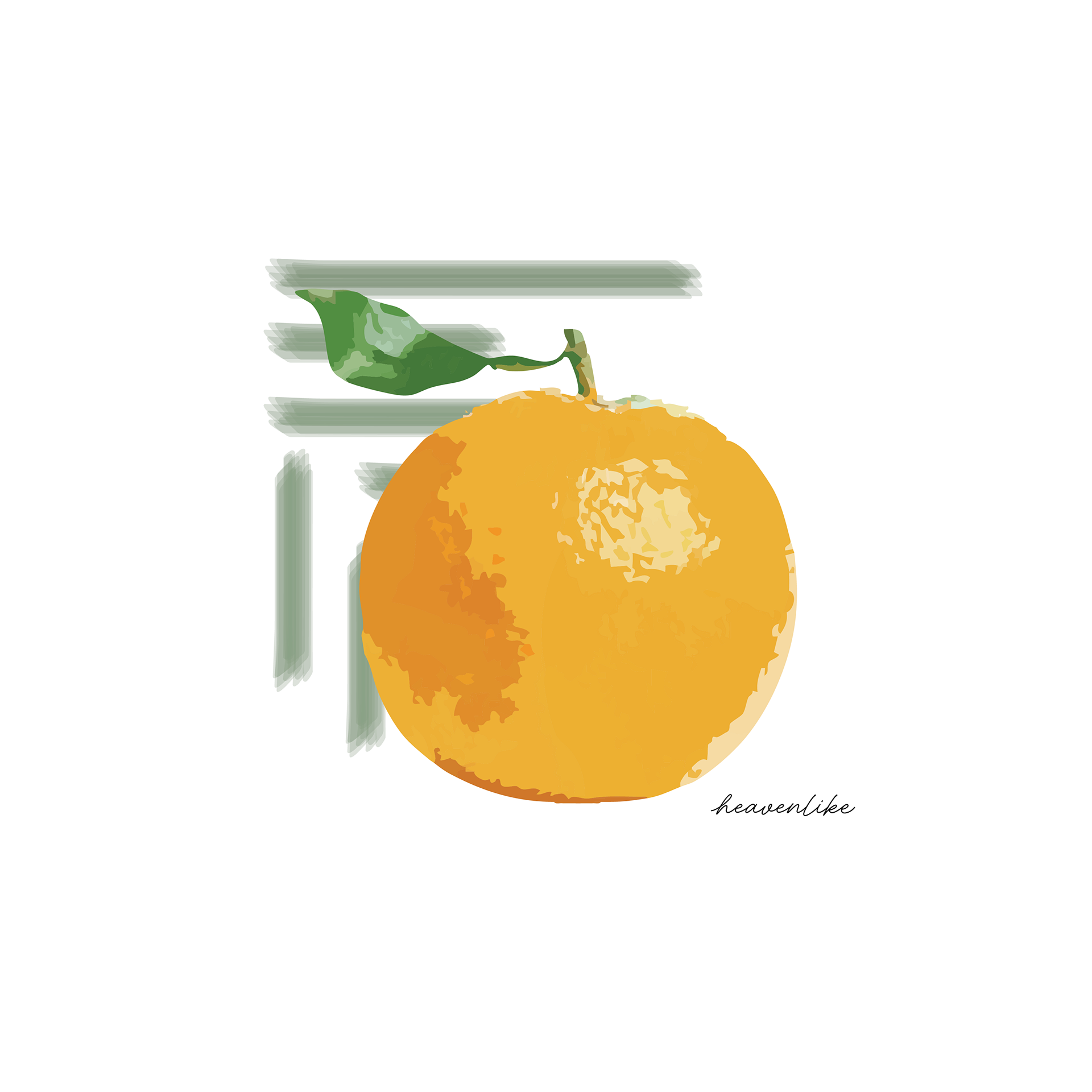
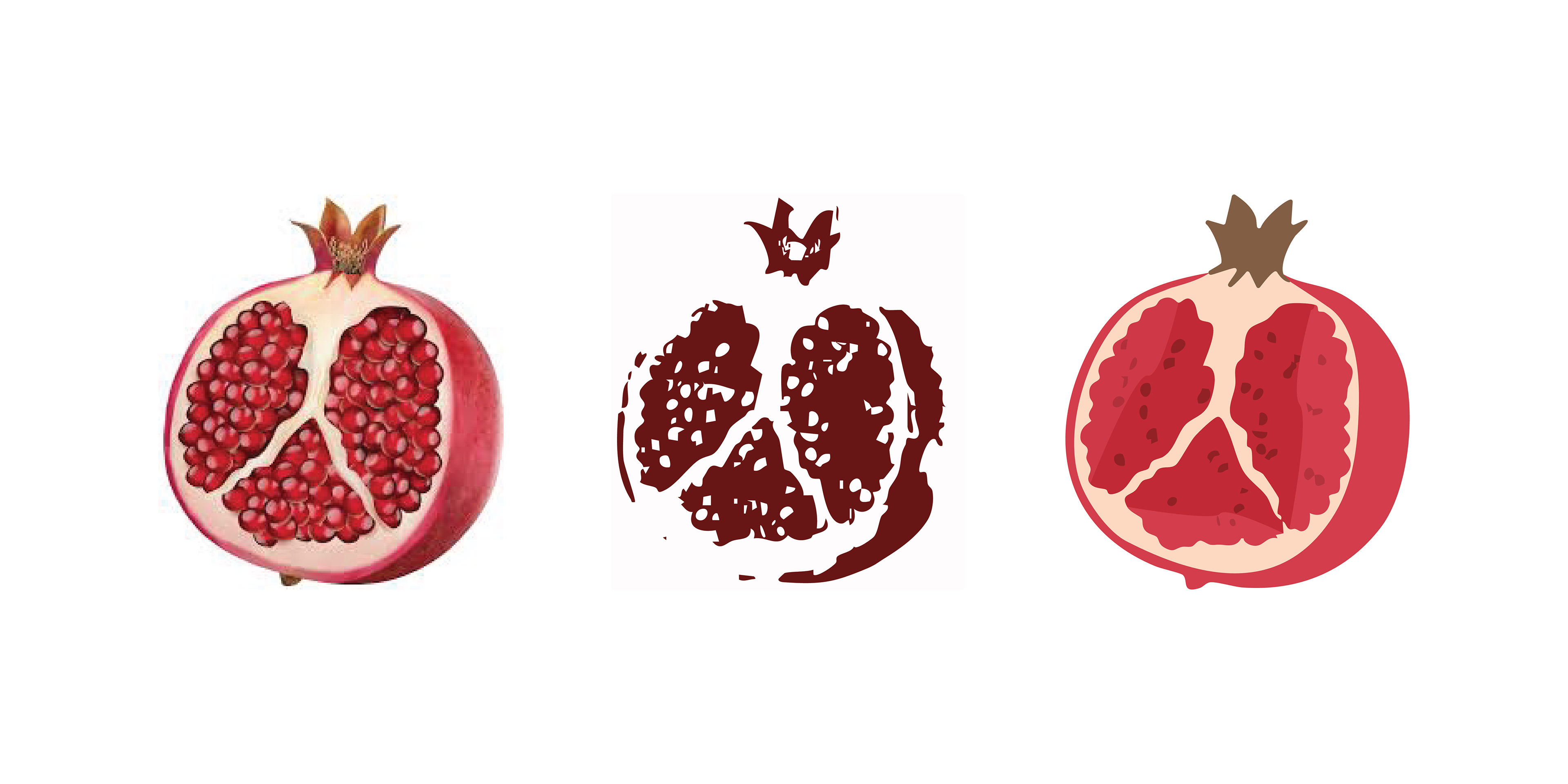
This last design is one of my favorites and was definitely the most challenging. The technical part making this design wasn't nearly as challenging as coming up with the idea itself. The client wanted a sort of sequence that started with fruit and ended with a smoothie. The hard part was finding a way to show that without breaking away from the simplistic aesthetic of the previous designs. At first I wanted to go with the final design all the way on bottom right. I felt like the concept itself already included more elements than the previous design so I didn't want to overcrowd it by adding multiple colors to each element.
In the end, the client wanted more color to be involved in each element of the design. To do this while still keeping the final design simple, I used the same method that I used with the pomegranate design. This one was definitely interesting because as I was going through each element and recoloring all the individual parts of them, I kept thinking "there's no way this is going to end up looking not overcrowded with color and not tacky"...I was, thankfully, very pleasantly surprised once the design was finished.
-In the coming posts I will be showing the in progress work of the website and photoshoots-