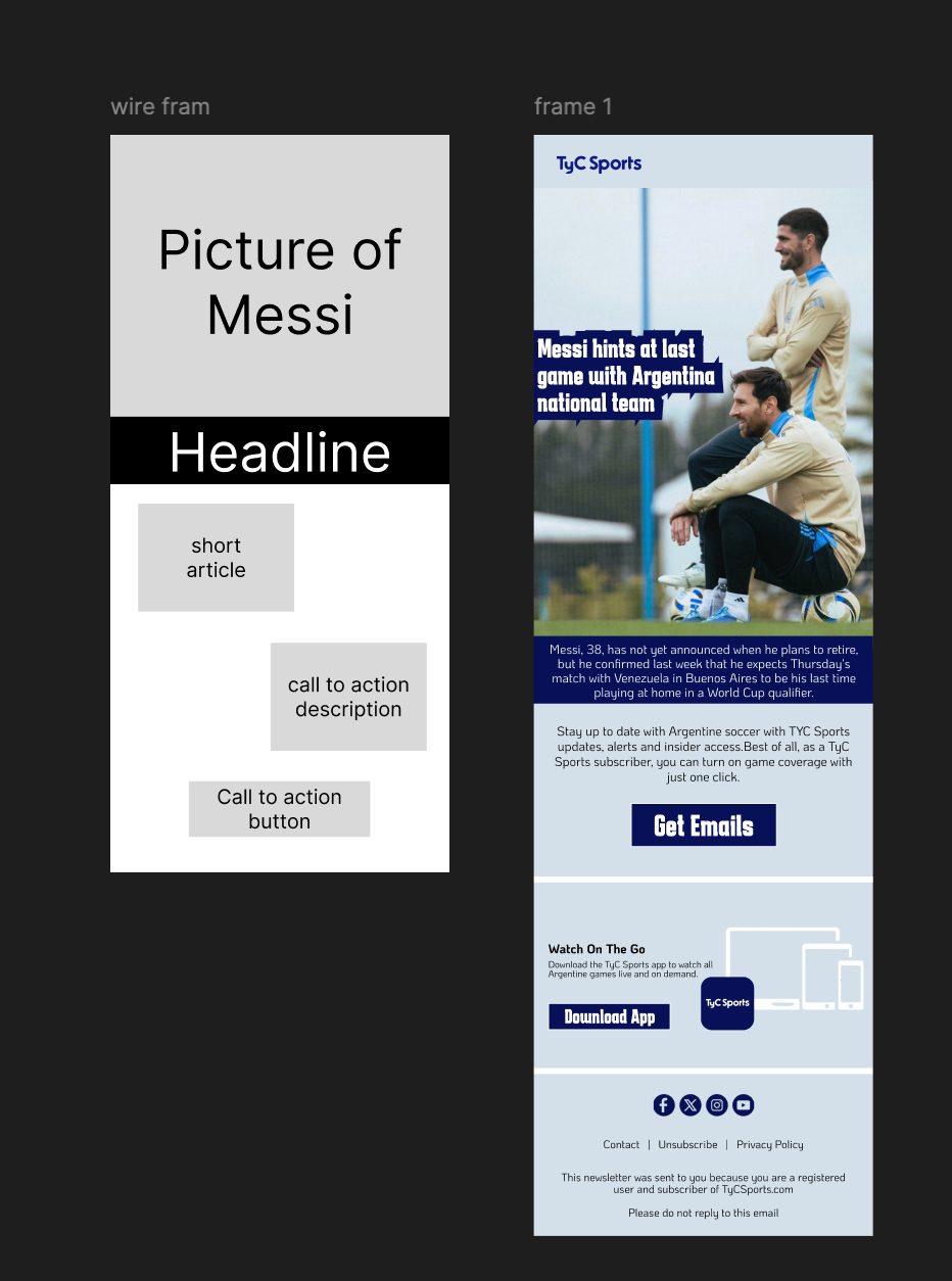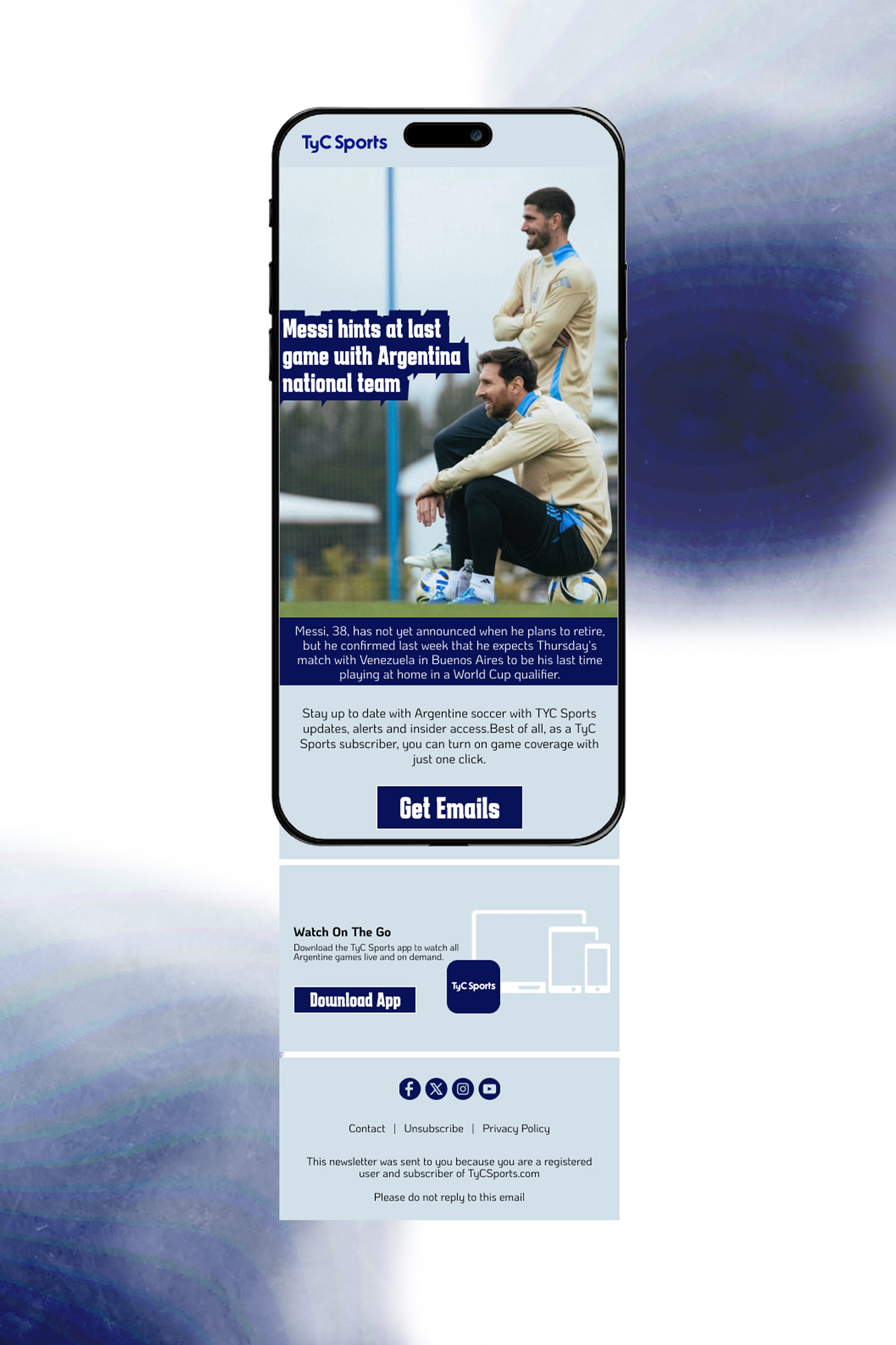


Wire frame and design - Figma, Layout - Miro, Mock up - Photoshop
While on the job hunt, I've ran into the term "email design" a couple times. I never realized that companies have designers specifically for designing emails, but once I read about the process of designing emails I quickly understood why. It was super fun and interesting to dive into a new sector of design with its own rules.
Since email design was completely new to me, I started out with jotting down some notes from my brief research so that I knew exactly what I was trying to achieve through my final composition. I then found some examples from my own email inbox because I felt as if that was the closest I could possibly get to real world examples. After collecting some examples, I jotted down the next steps I could take to start designing. I decided to use the dimensions of an Iphone after reading a stat saying that around 60% of emails are opened on a mobile phone.
Once I started designing, I found myself getting used to the confined space I had to work with pretty quickly. I made my wireframe, got familiar with the colors and fonts of the company that I was theoretically designing for, found/made my assets and arranged everything together.
The thing I probably found most interesting about email design was the confined space that I had to work in. It was interesting to not be so focused on the content or writing of the design but more so the call to action. All in all it felt refreshing to design with with such a clearly set goal in my head. Next week I am going to use the same creative process to design an email for a clothing company. At the moment I have no concrete ideas but I was thinking of making the second email with the dimensions of a laptop and to keep working in Figma to possibly make the second design with some moving components.
