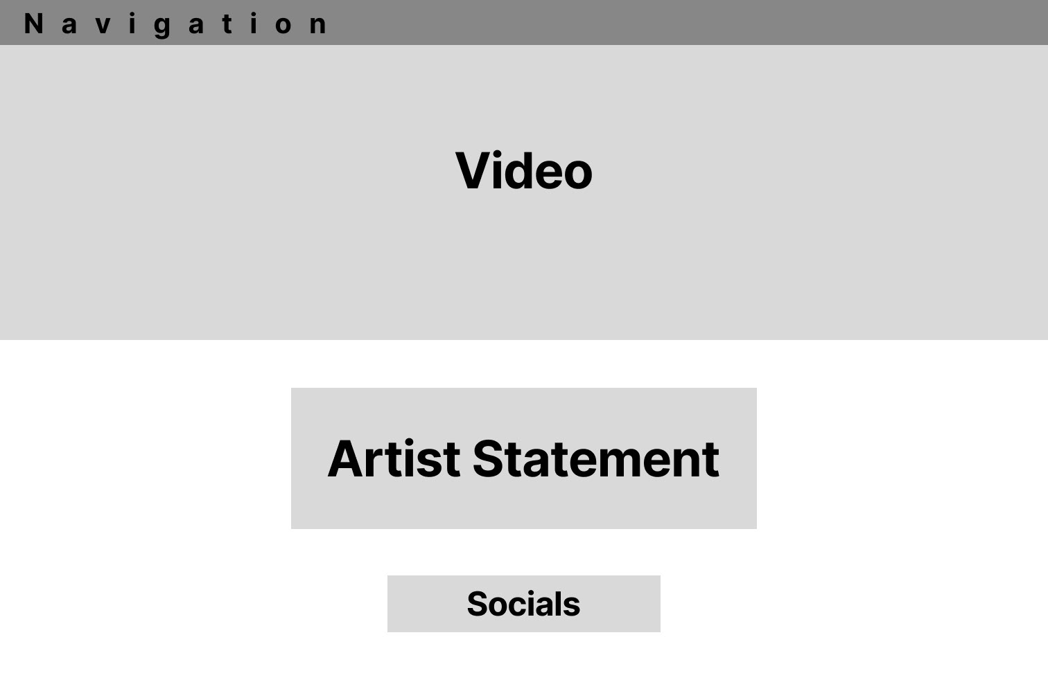
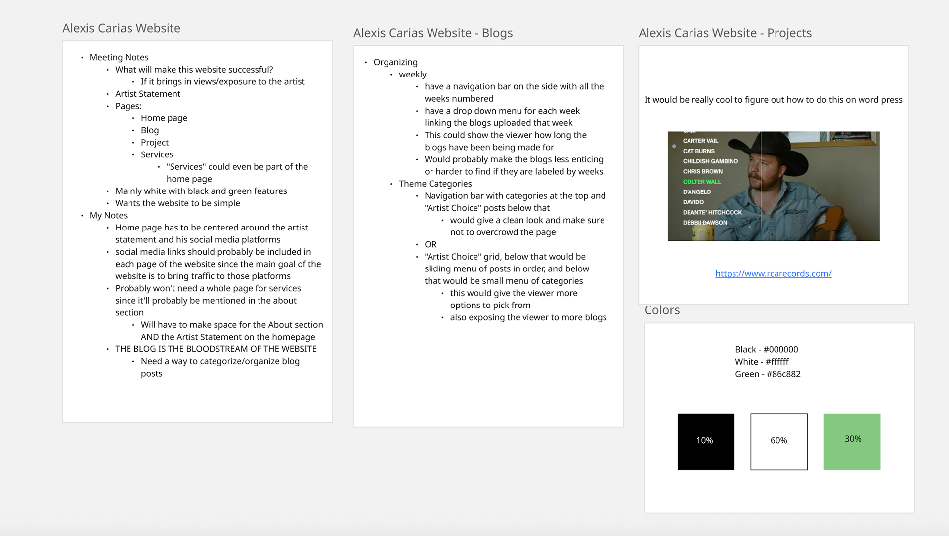
This week I started a freelance web design project. The client wants a personal website that'll bring more traction to his personal projects and services like music videos, public talks and blogs. When I asked the client what would make this website a successful one, he said "If it brings me views and clicks". In the bottom right picture are my notes on how I would be able to achieve that outcome. In the notes I put a heavy emphasis on social media links and on the possibility of having those links on every page of the website so that the viewer can get to my clients social media as effortlessly as possible.
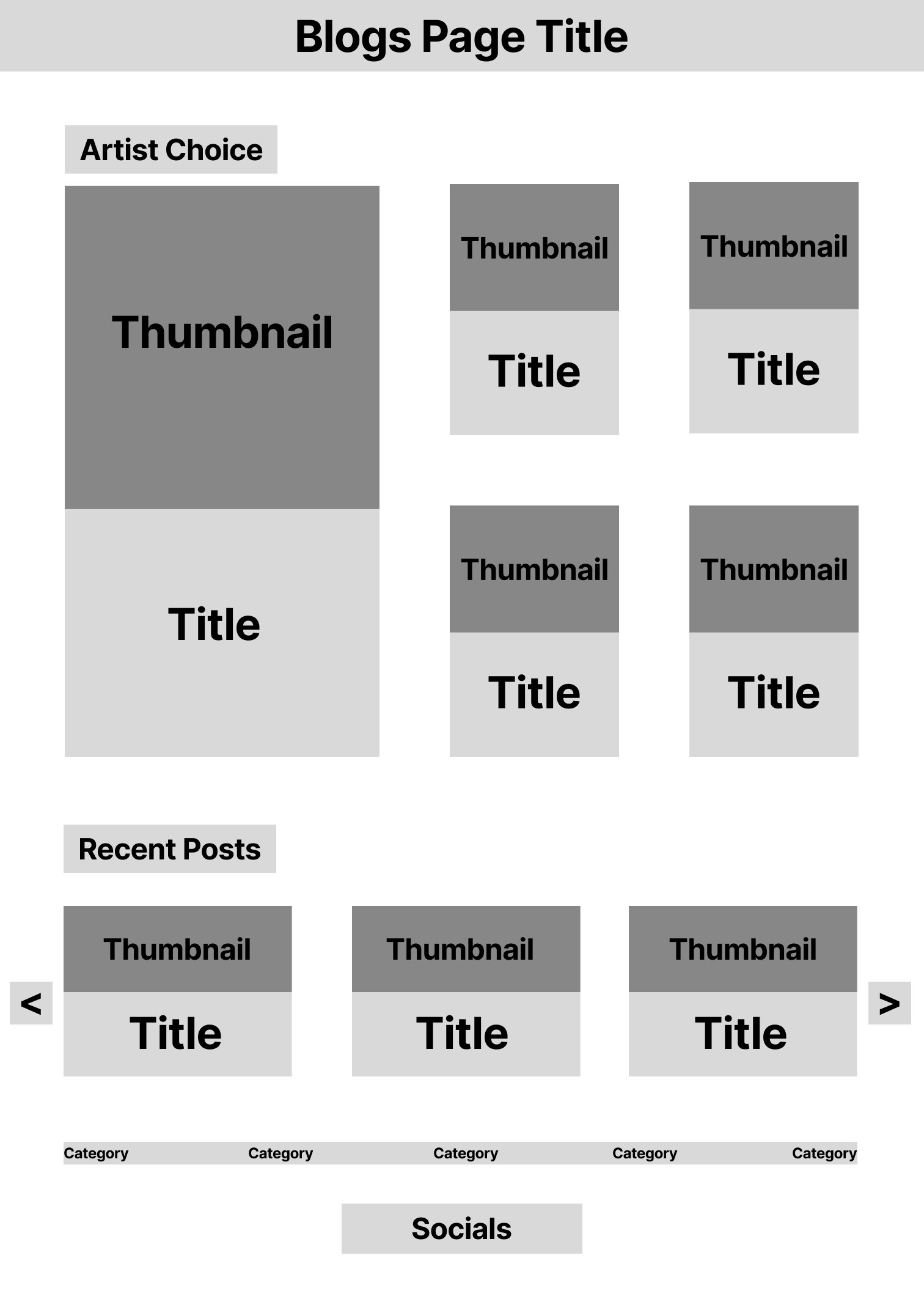
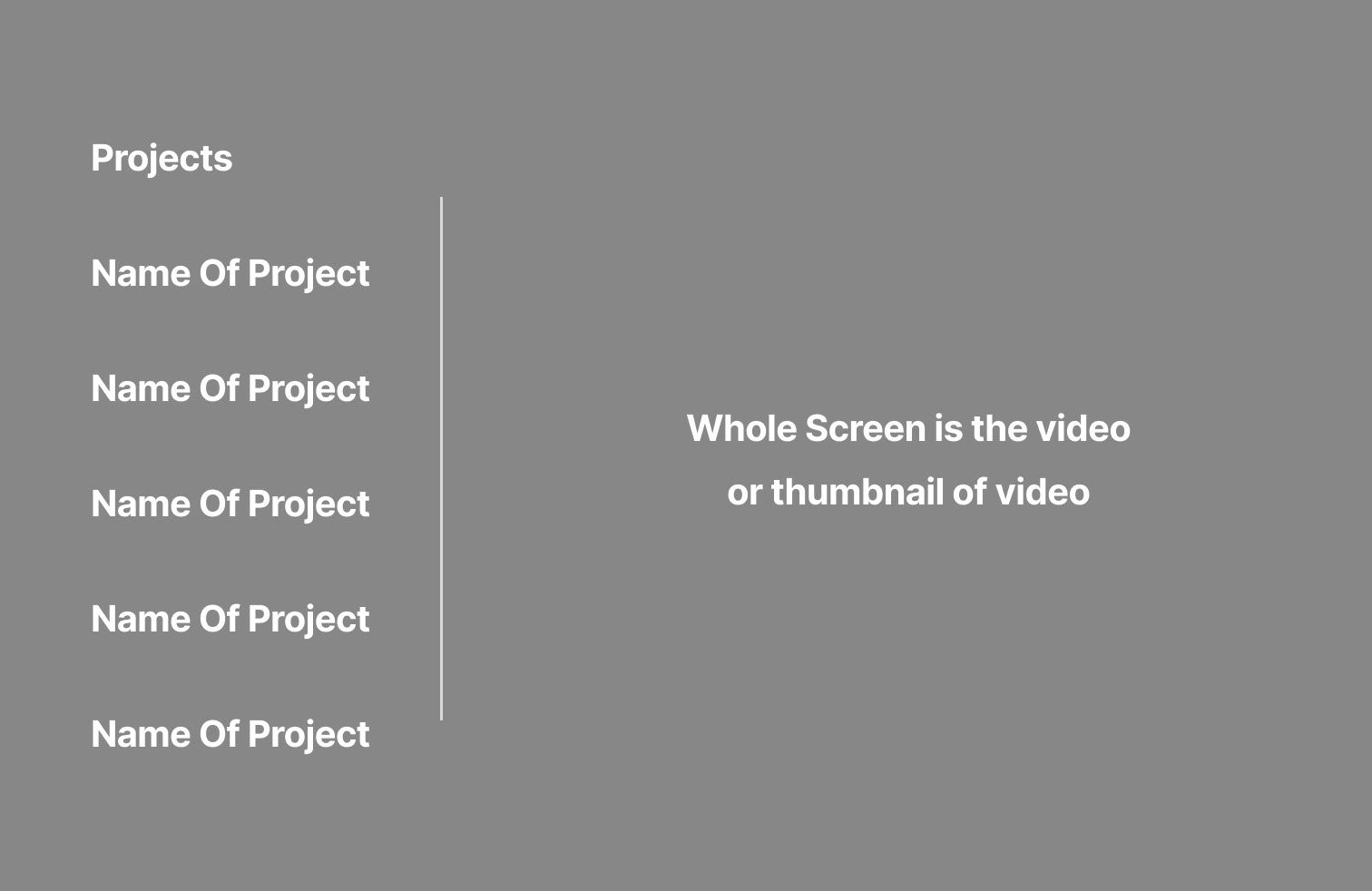
Other notes on that bottom right picture include some brainstorming notes about how I could best organize the blog page of the website so that it is easy to navigate for the viewer and so that it doesn't get crowded with too many posts on the screen at one time. There is also an inspiration picture included there that I am going to keep for the "Projects" page of the website. I was really drawn to this section of RCA Records website that showed off their artists because it filled up the entire screen with the picture of the artist while at the same time having a list that was very easy to navigate and didn't take from or block the image. Lastly, I'm using the 60% - 30% - 10% rule, that I recently found out about, for the colors of the site. I'm going with 60% white so that the website looks clean and easily legible, 30% green to give the website a feeling of joy and freshness like the clients work that will be displayed on it (as per request of the client) and 10% black for text and accents.
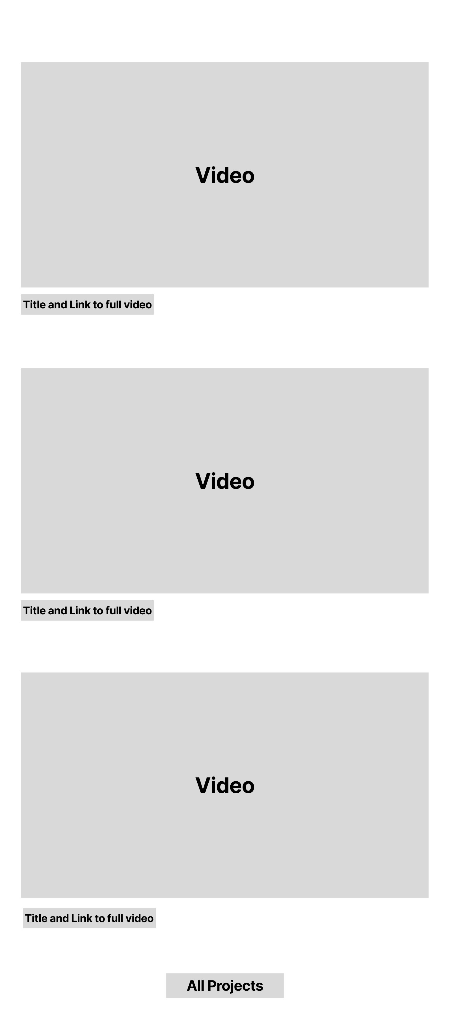
As for the wireframes, my main objective so far has been to make the website look clean and organized while showing off the clients work at a large scale, literally, for best quality.
-September 26, 2025-