
Background made in photoshop and after effects - wire frame, design and mock up made in figma
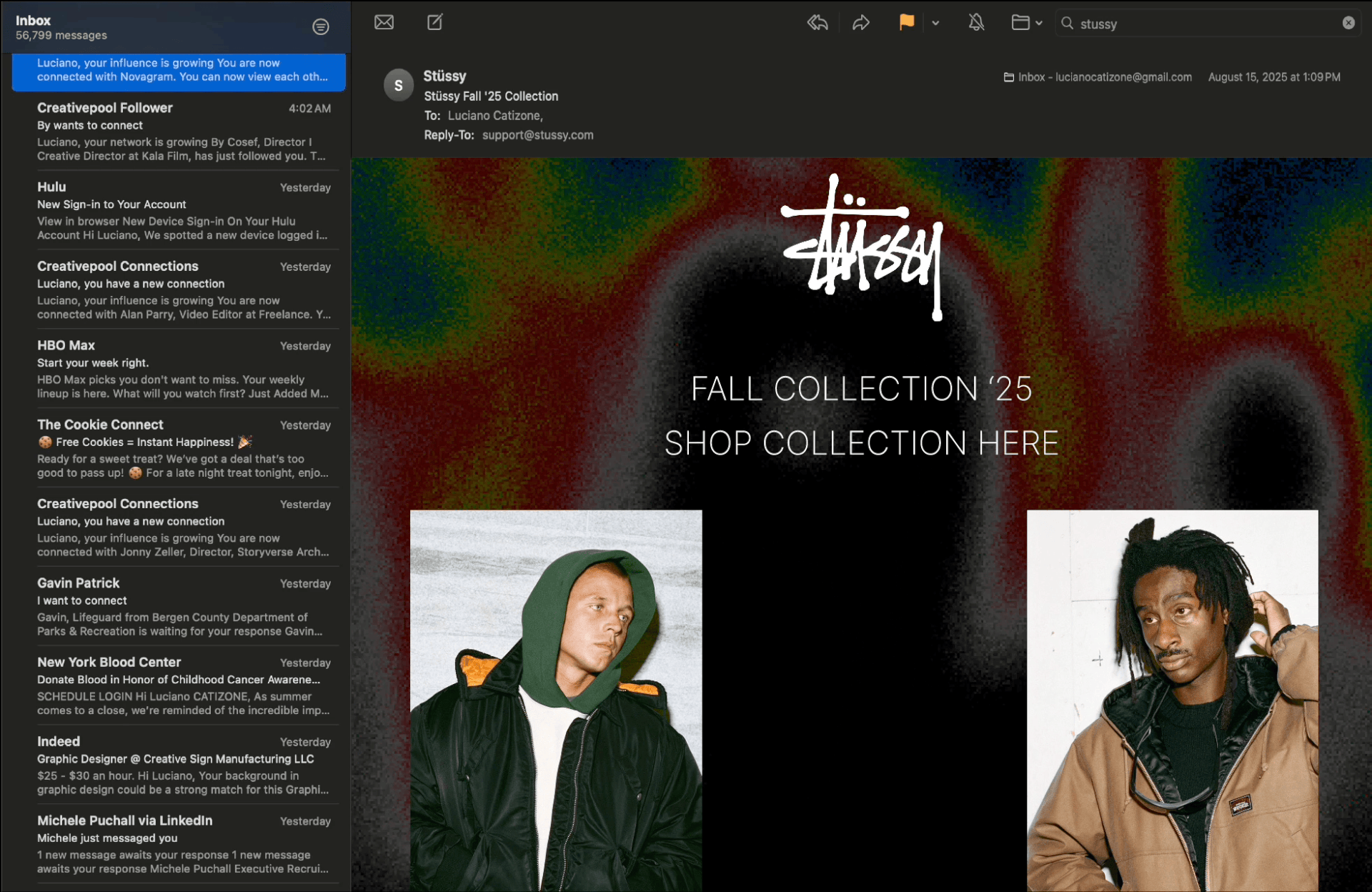
- -Second installment of email design- - For this one I wanted to dive into the fashion industry with a clothing brand that I have always been really drawn to. I decided to go with this brand because I've always thought that their fashion and design style matches my design style. I thought that this would give me room to be creative and experiment a little more since this would be the second email design that I would be making.
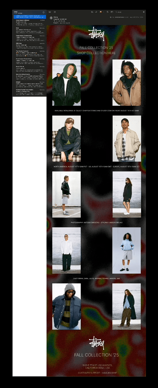
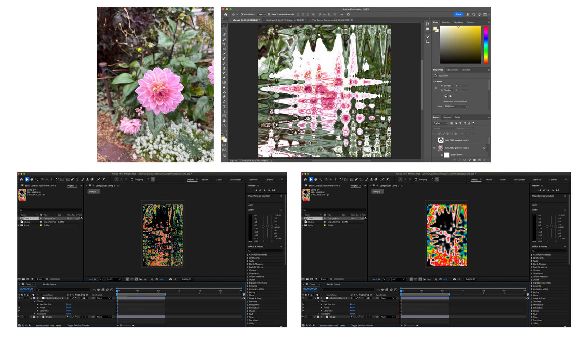
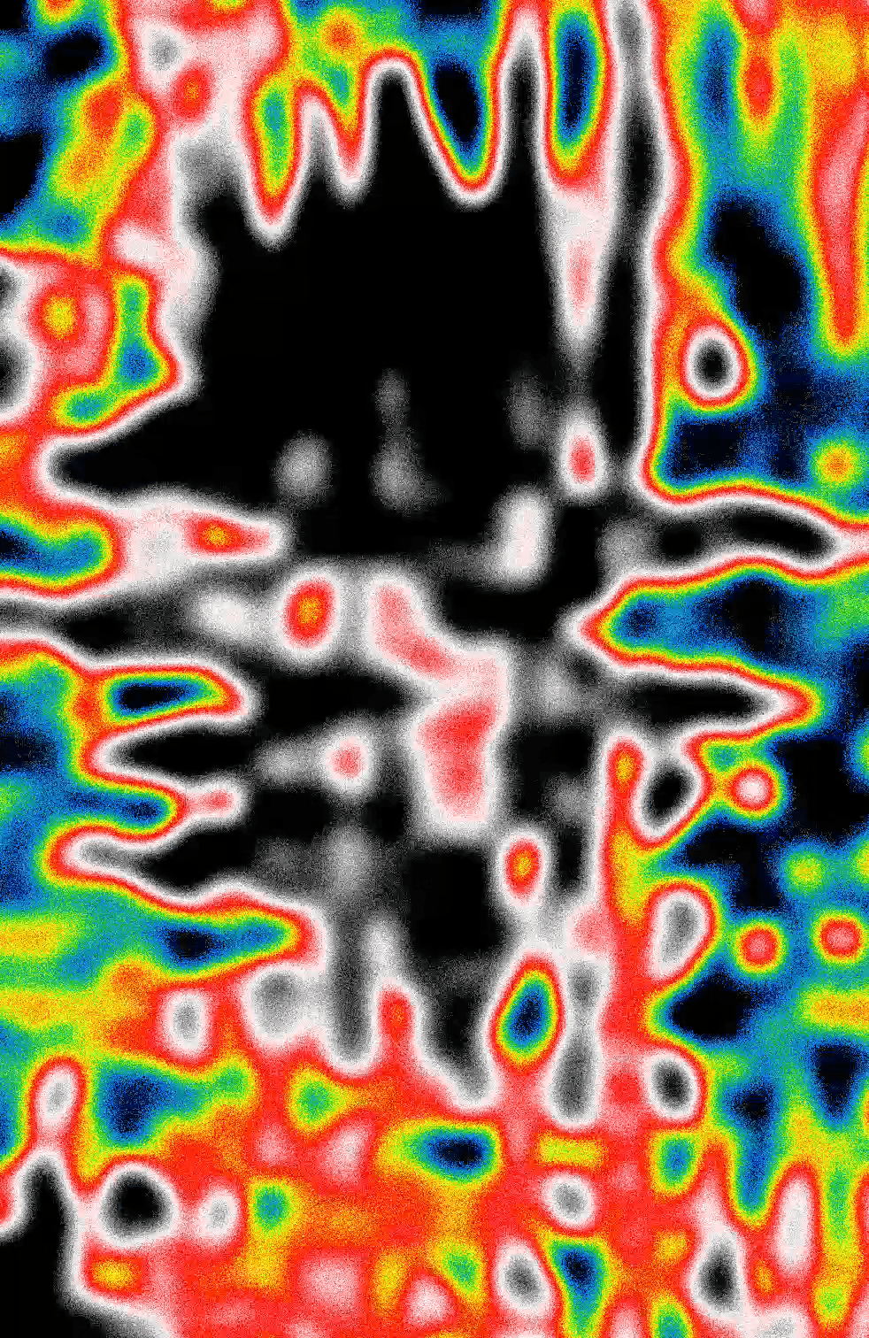
For the layout and composition of this email design I mimicked the brands "look book" sort of feel that I usually find in their promotional emails. I had previously mentioned that I wanted to try to add a dynamic element to my second email design so that is what I attempted to do with the background. I remembered recently seeing a shirt from this brand with a heat map on it so that was where the initial idea for the background came from. After deciding on going with a heat map, I wanted to make my own pattern for it so I took one of my recent pictures from my cameral roll and distorted it in photoshop using the "wave" effect. I then took that into after effects, made it move with the "turbulent displace" effect and keyframes and finally applied the color and noise with the "colorama" effect (all with the help of a instagram reel and youtube video tutorial).
I definitely had a lot of fun with this project. In a way it was relieving not having to worry so much about the content or information that had to be included in the design. I found that it gave me a lot more time and headspace to think about the background/the dynamic part of the design which is what I wanted to focus most on in the first place. My favorite part was definitely making the heat map. That part was especially satisfying because instead of easily finding one online, I saw the ins and outs of exactly how an effect or pattern like a heat map can be made.
I'd definitely say that, for me, this has been one of the more pleasing personal projects that I've worked on recently. I think that's mostly because I got to use and learn a new software to make something 100% from scratch. I will definitely be experimenting more in after effects in the near future.
-September 12, 2025-
Wire frame and design - Figma, Layout - Miro, Mock up - Photoshop
While on the job hunt, I've ran into the term "email design" a couple times. I never realized that companies have designers specifically for designing emails, but once I read about the process of designing emails I quickly understood why. It was super fun and interesting to dive into a new sector of design with its own rules.
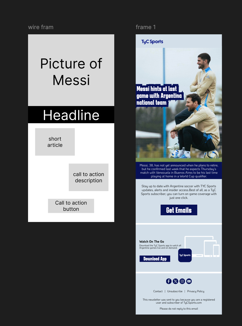
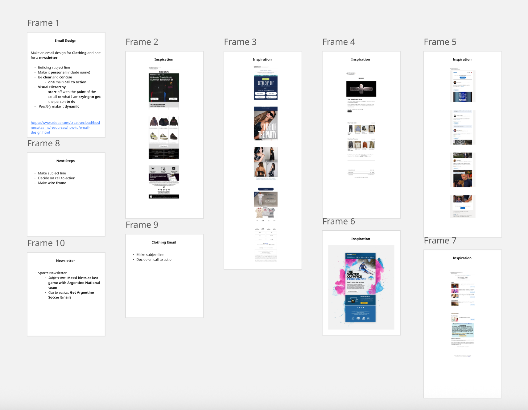
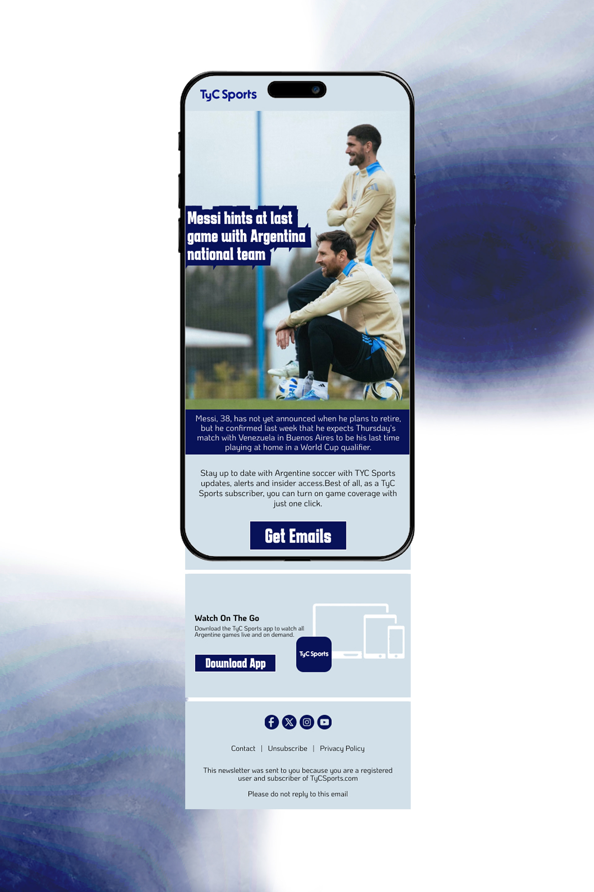
Since email design was completely new to me, I started out with jotting down some notes from my brief research so that I knew exactly what I was trying to achieve through my final composition. I then found some examples from my own email inbox because I felt as if that was the closest I could possibly get to real world examples. After collecting some examples, I jotted down the next steps I could take to start designing. I decided to use the dimensions of an Iphone after reading a stat saying that around 60% of emails are opened on a mobile phone.
Once I started designing, I found myself getting used to the confined space I had to work with pretty quickly. I made my wireframe, got familiar with the colors and fonts of the company that I was theoretically designing for, found/made my assets and arranged everything together.
The thing I probably found most interesting about email design was the confined space that I had to work in. It was interesting to not be so focused on the content or writing of the design but more so the call to action. All in all it felt refreshing to design with with such a clearly set goal in my head. Next week I am going to use the same creative process to design an email for a clothing company. At the moment I have no concrete ideas but I was thinking of making the second email with the dimensions of a laptop and to keep working in Figma to possibly make the second design with some moving components.
-September 5, 2025-
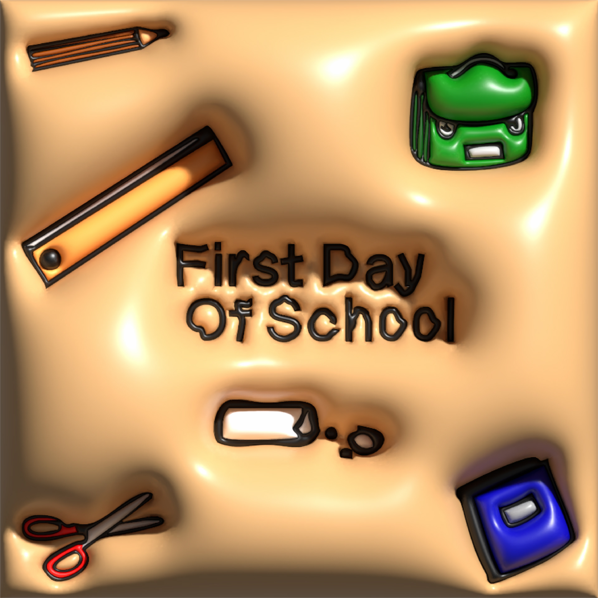
Illustrator
I started a new job at my high school as a “dedicated substitute”, which basically means study hall teacher, so I thought that this design idea would be appropriate. I wanted to try this 3D “inflate” effect that I saw on social media a while back so the idea or theme of the composition wasn’t thought about too deeply at all. I used the first school items that came to mind in order to take up some room in the background. I decided on the font because I felt as if it had a childish, handwritten feel to it. Once my composition was laid out I grouped all the items of it together and simply applied the 3D inflate effect to it. After applying the effect, I messed around with the lighting setting to give it that natural shine that it has.
All in all, I’m very satisfied with how it came out. I think it looks super cool and brings a new element of realism and 3D that I don’t normally have in my designs. It did get me thinking, it’s a little crazy that so much detail could be applied to an entire composition by only hitting two buttons. It almost feels like a cheap way of achieving an effect but at the same time very effective and convenient. I can’t fully discern my feelings on the ease of the whole thing at the moment.
-August 28, 2025-