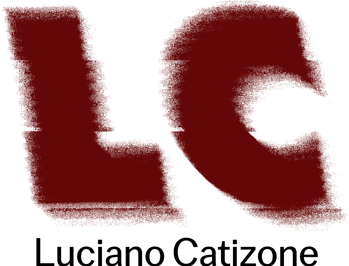
I included the figures to go along with the name of the company. All the colors and textures used in this project were used with the intention of giving the company a sort of grunge, rough feel.
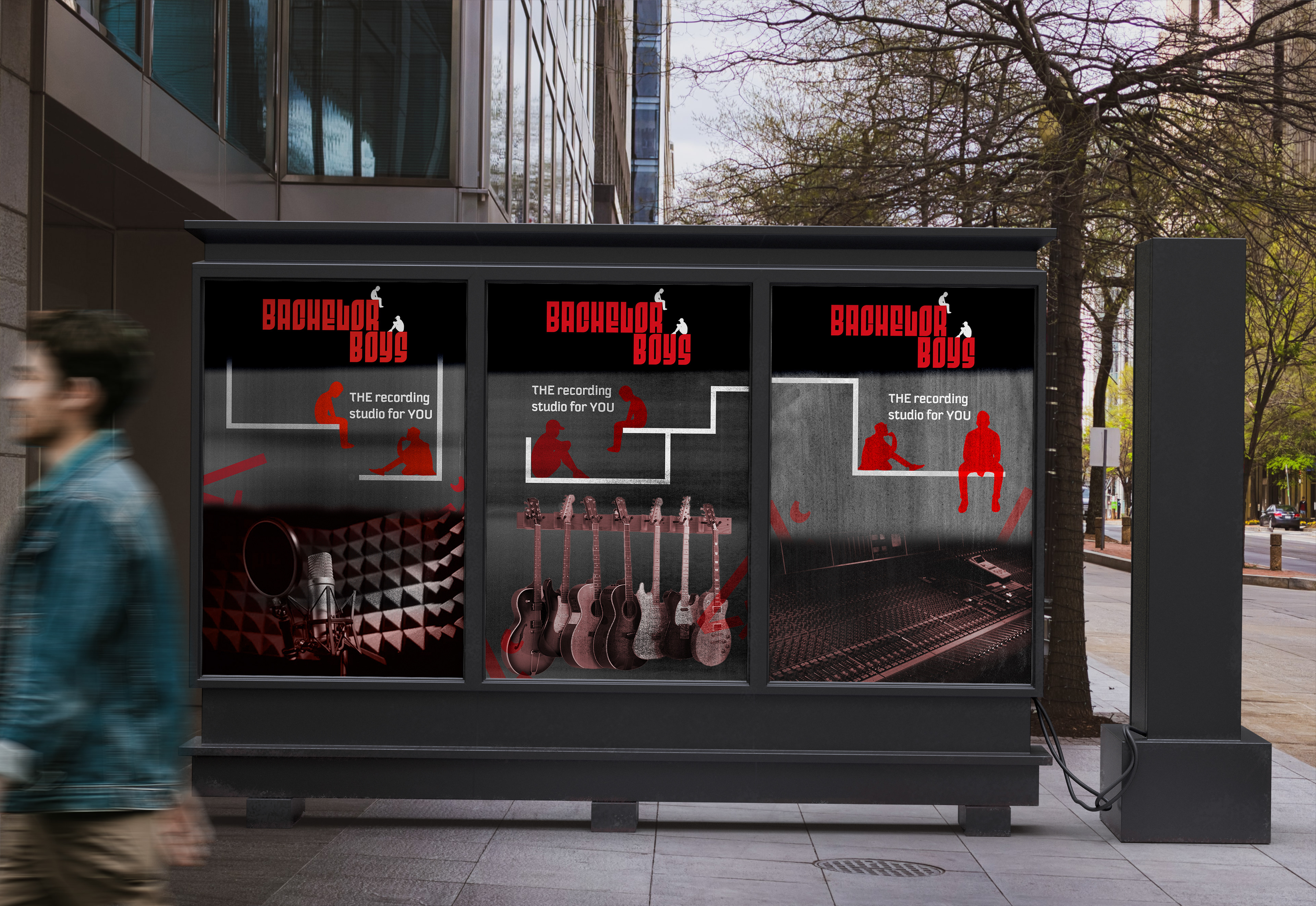
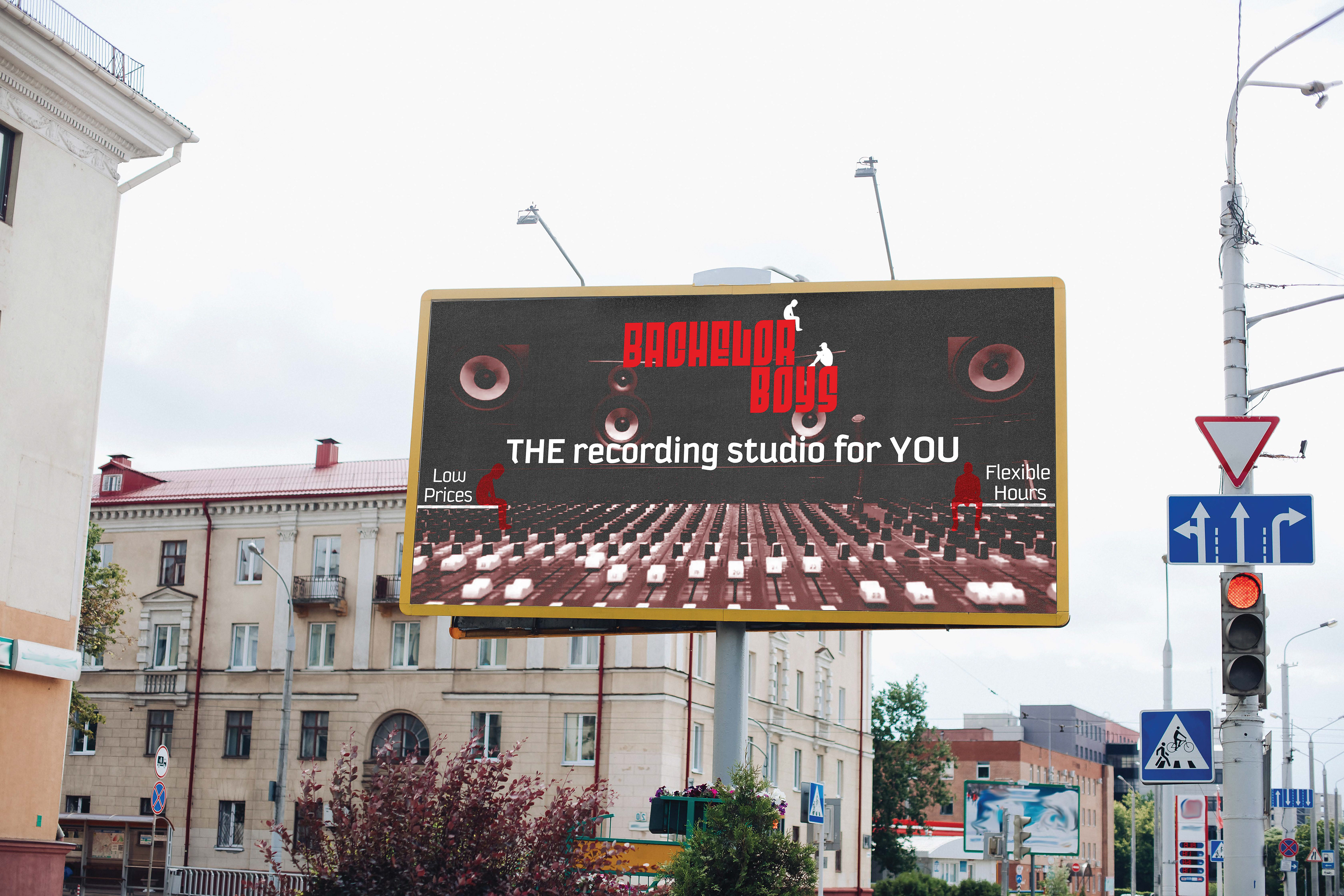
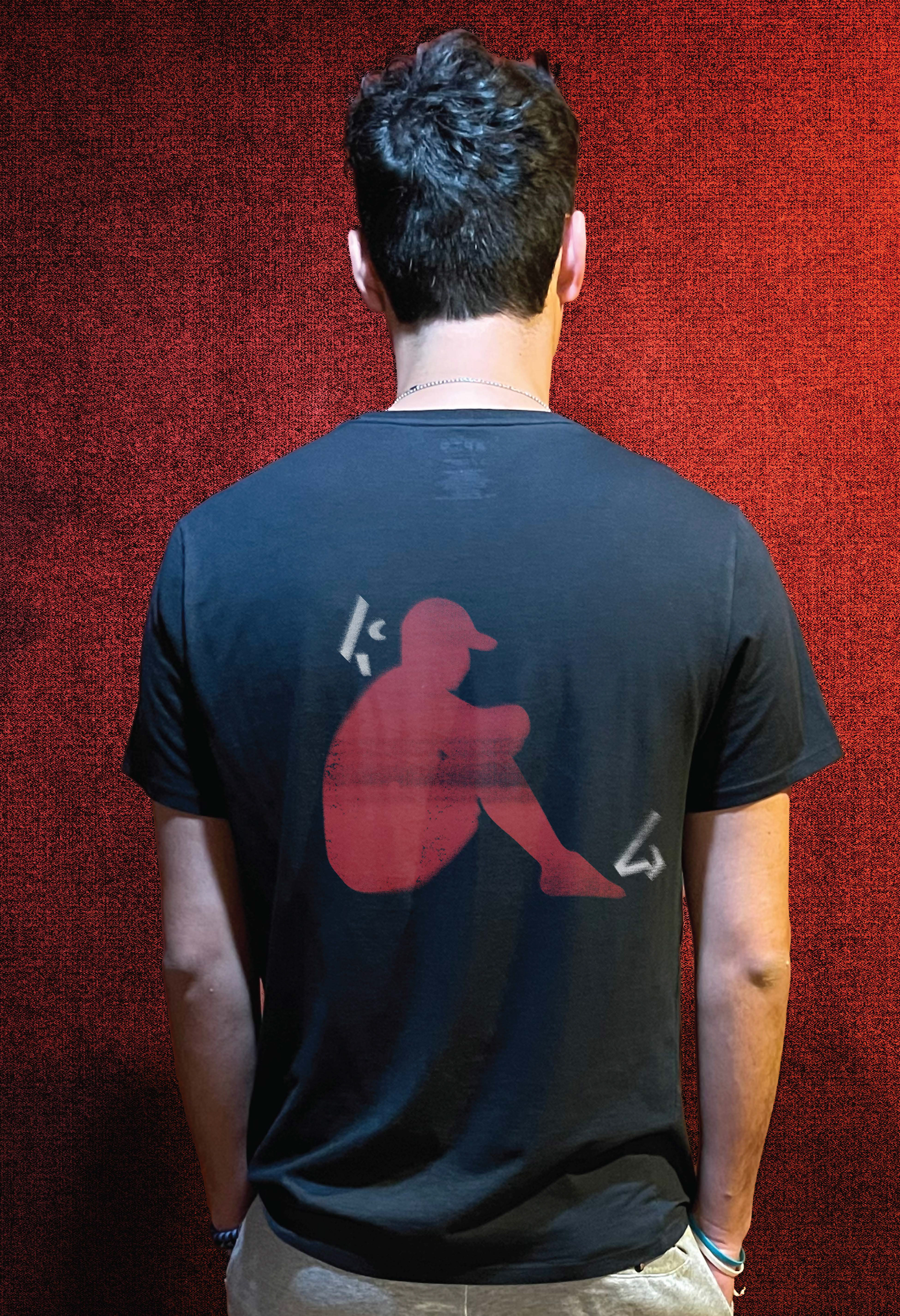
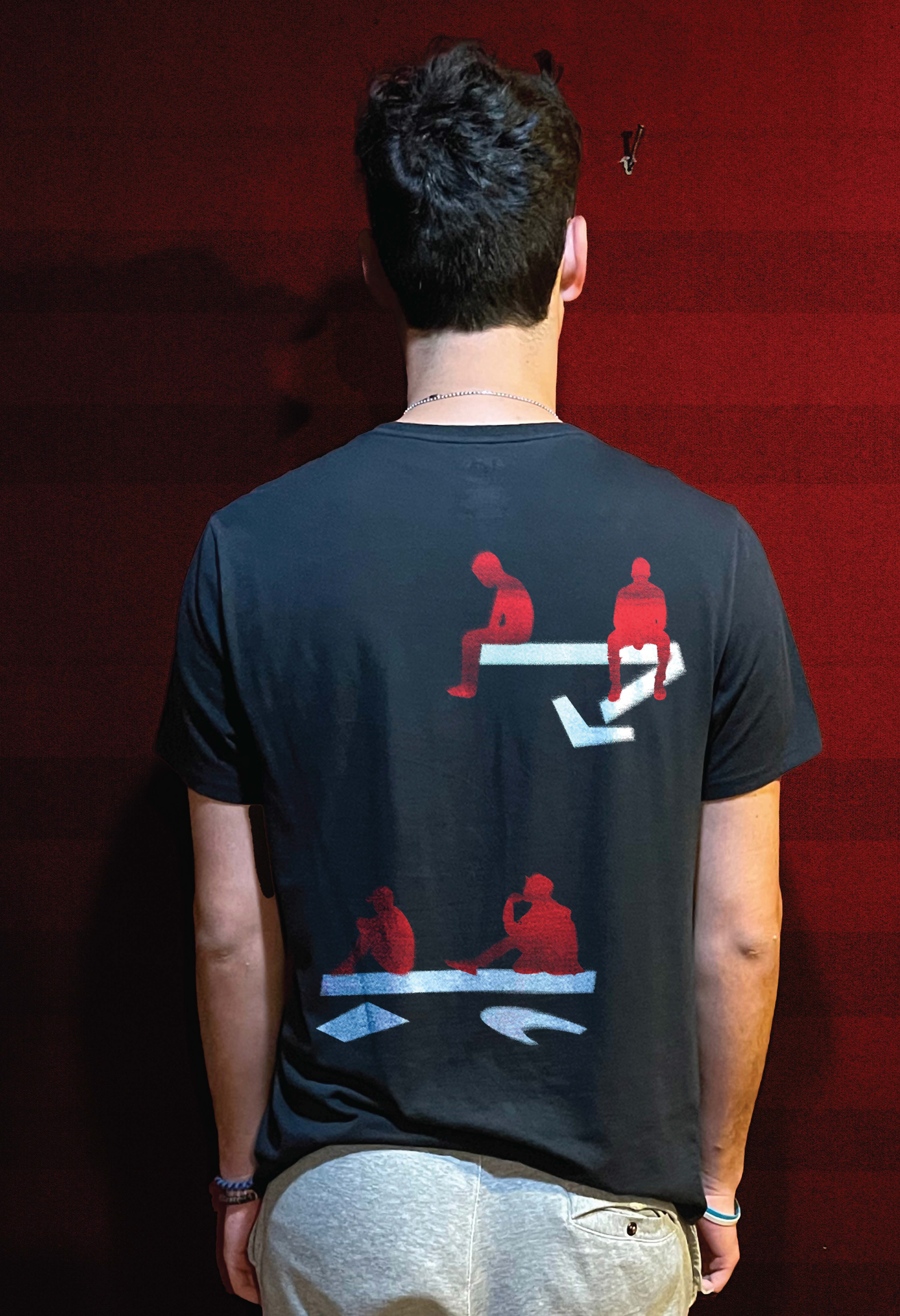
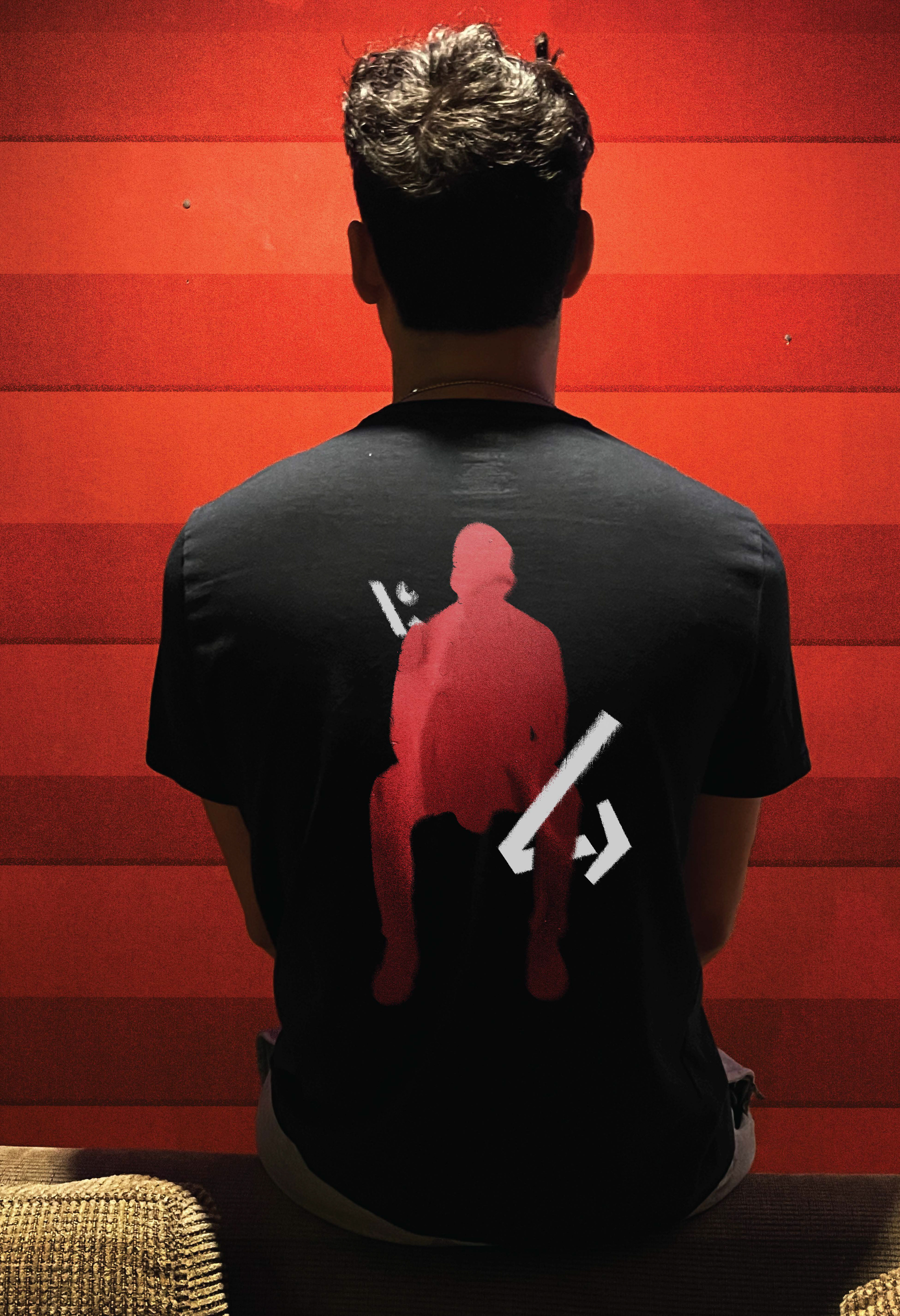
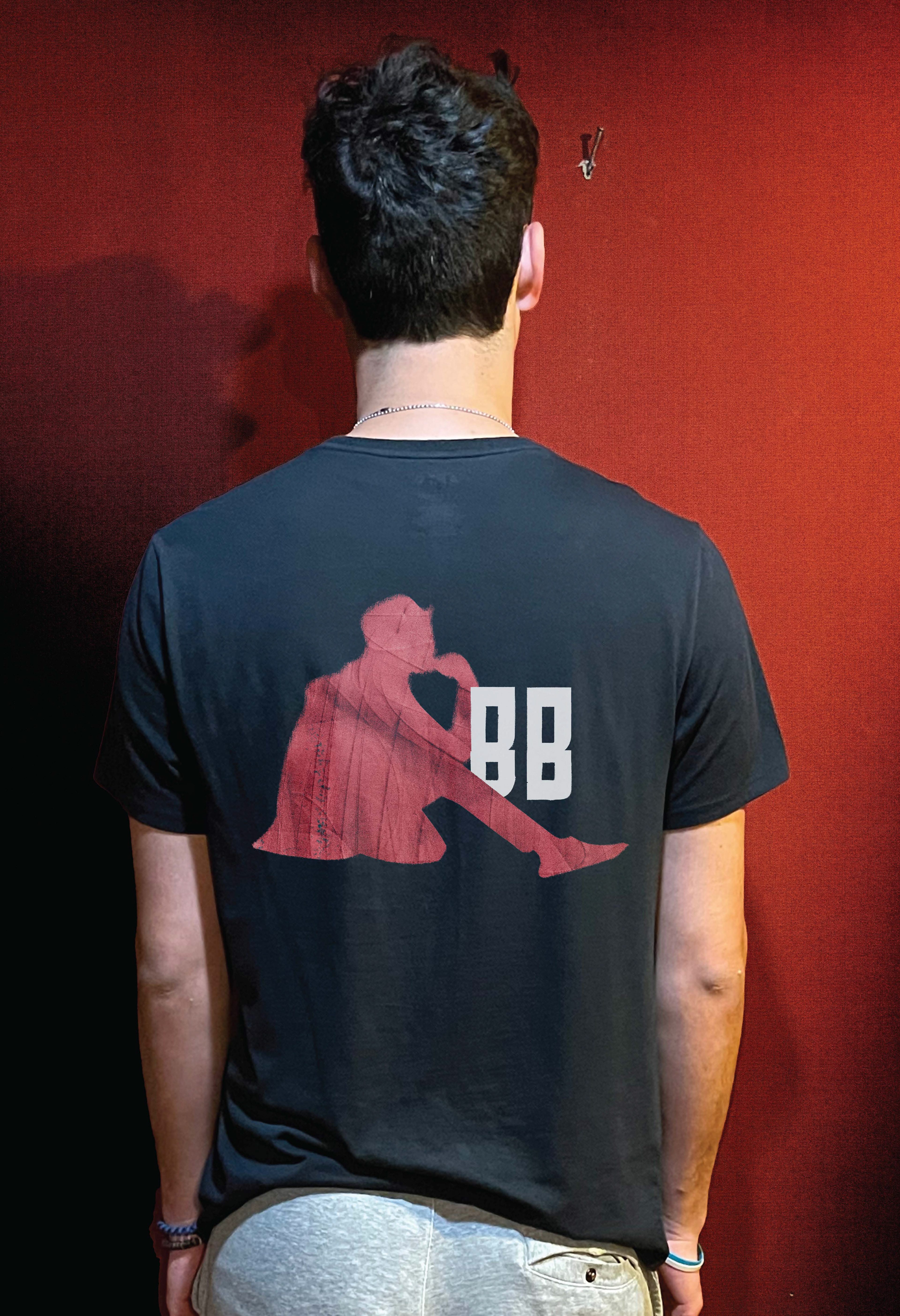
During one of my college classes i was tasked with creating a brand identity for a hypothetical company of my choosing. this brand identity had to include a brand style guide, promotional design and merchandise